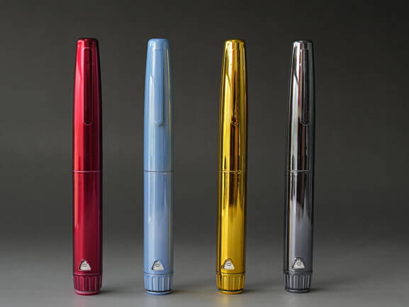
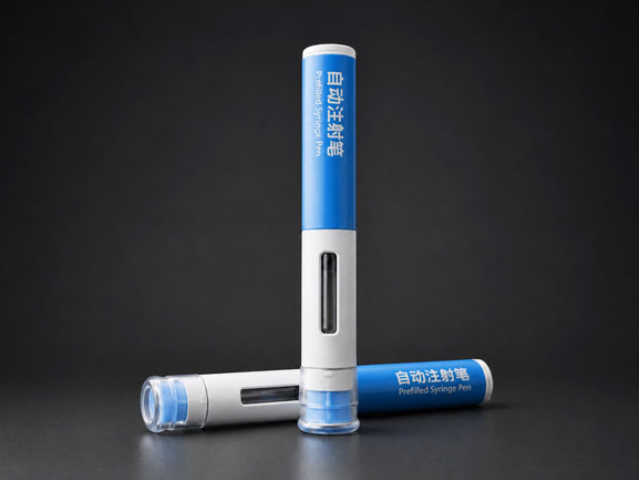
A logo can identify a peptide pen. It rarely gives customers a reason to choose it. When several brands use similar cartridge formats and familiar pen shapes, printing a different name on the housing changes ownership, but not the product experience. The stronger private-label projects treat the pen as part of the brand system: its material, finish, dose display, handling sequence, refill presentation, packaging and technical evidence all support the same market position.
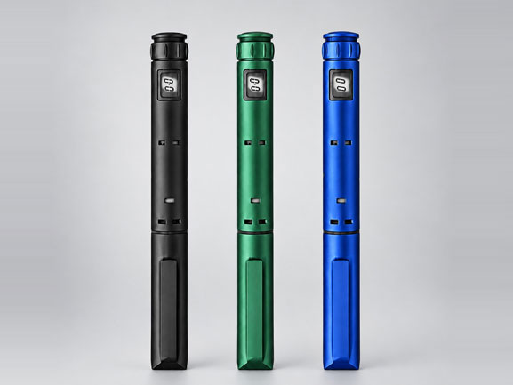
This distinction matters especially for peptide brands. The device may be one of the few parts of the product that a customer sees and handles repeatedly. A premium claim that appears only on the carton can feel disconnected if the pen itself looks generic, the dose window is difficult to read or the refill process has not been considered. Differentiation therefore begins before artwork is prepared.
The practical question is not “Where can we print the logo?” It is “What should the complete pen experience communicate about this brand, and which device decisions can support that message?”
Begin with a Brand Promise That Can Be Translated into Specifications
Words such as premium, clinical, discreet and easy to use sound useful in a marketing brief, but they do not yet tell an engineering or manufacturing team what to build. The brief becomes actionable only when each promise is translated into visible or measurable choices.
A brand positioned around clinical precision may prioritize a restrained color palette, high-contrast dose markings, clear feedback and controlled documentation. A lifestyle-led peptide brand may care more about portability, discreet appearance and a finish that does not look like a conventional hospital device. A program built around long-term use may need a durable reusable body, a coherent refill presentation and a carrying solution that makes repeated use feel intentional rather than improvised.
These directions are not interchangeable. Trying to express all of them at once usually produces a decorated standard pen rather than a distinctive product. A useful first step is to select two or three brand attributes and agree on how each one should appear in the device, packaging and user workflow.
Make the Platform Architecture Part of the Brand Decision
The most consequential private-label choice is often made before color is discussed: the choice of device platform. A disposable pen, a reusable cartridge pen and a dual-chamber platform create different supply models, user routines and product stories. The correct direction depends on the formulation, primary container, dose requirements, intended use and commercial model.
For example, a reusable pen can support a longer-term relationship in which the customer keeps the device and replaces cartridges. That experience can make housing quality, balance and finish more important because the pen remains in use. A disposable platform can simplify the presentation of each filled unit, but it shifts attention toward the complete single-unit experience, waste considerations, pack configuration and reliable consistency across larger quantities. A dual-chamber pen addresses products whose components need to remain separated before use; its value is not decorative customization but the reconstitution and delivery workflow.
Private-label differentiation should therefore be built on a technically suitable platform. A brand concept cannot compensate for a mismatch between the pen, cartridge, formulation and intended dose.
Build a Visual System, Not a Collection of Color Choices
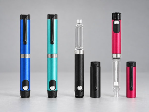
Once a platform direction is selected, appearance can be developed as a system. The goal is not to apply the maximum number of custom elements. It is to make the device recognizable, legible and consistent from the first sample through the commercial presentation.
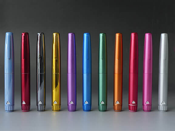
Housing Material and Finish
A polymer housing, a metallic-finish polymer housing and an actual metal housing create different impressions and should be described accurately. Metallic-finish plastic can provide a metal-like visual effect while retaining a polymer structure. A metal reusable pen offers a different material direction and may be chosen when weight, touch and long-term durability are important to the concept. The term “galvanized” should not be used unless the product actually uses a zinc-coating process.
Color Hierarchy
Color works best when it has a job. The main body can carry the brand family, while the cap, dose knob, label or refill packaging can distinguish strengths, programs or markets. Randomly applying brand colors to every available component can weaken recognition and create confusion. A controlled hierarchy also makes future line extensions easier because the system already defines what stays constant and what changes.
Dose Display and Legibility
The dose window is not a secondary graphic area. Number size, contrast, viewing angle and surrounding color can influence how easily the selected dose is checked. A premium-looking finish loses value if it reduces readability. Artwork review should therefore include the functional viewing areas, not only the logo zone.
Treat Technical Evidence as Part of the Brand Experience
For peptide brand founders, distributors and development teams, confidence is created not only by appearance but also by the quality of the information behind the sample. Drawings, specifications, material information, sample identification, agreed acceptance criteria and change communication all influence whether the project feels controlled.
Standards should be described with care. ISO 13485 concerns a quality management system; it should not be presented as though it were a performance certificate for every pen configuration. The ISO 11608 series addresses needle-based injection systems, but applicable testing and claims depend on the specific device, container and intended use. A platform statement is not a substitute for project-specific verification.
For projects intended to become a drug-device product, the final brand owner and its development partners also need to consider the regulatory pathway, human factors, labeling, risk management and verification for the complete configuration. Device samples are valuable for feasibility work, but an unfilled sample alone does not establish compatibility or suitability for a particular peptide formulation.
Use a Sample Ladder Instead of Asking for a Finished Branded Pen First
Many private-label projects lose time because the first request combines appearance approval, cartridge compatibility and functional evaluation in one sample. Separating these questions creates a clearer path.
Start with a platform sample to understand the size, handling sequence and overall mechanism.
Move to a fit sample using the intended cartridge dimensions and relevant components to identify interface questions.
Prepare an appearance sample to confirm color, finish, printing position and the relationship between the pen and packaging.
Build a functional project sample after dose, container, needle interface and other requirements have been defined.
Freeze the approved configuration and documentation before treating the design as a commercial private-label product.
This staged approach prevents a beautiful appearance sample from being mistaken for a verified device configuration. It also gives founders and sourcing teams useful decision points before they commit to tooling, packaging or larger sample quantities.
A Better Definition of Private-Label Differentiation
A differentiated peptide pen is not simply a standard device with a different logo. It is a technically appropriate platform whose appearance, handling, refill model, packaging and supporting information express one clear product position.
That position does not have to be extravagant. A restrained clinical design with excellent legibility can be more distinctive than a heavily decorated pen. A metallic-finish reusable pen can support a premium visual direction without being described as a metal device. An actual metal platform can serve a different durability and tactile brief. A disposable pen can be differentiated through a coherent single-unit presentation and project-matched dose configuration. The right answer depends on what the brand needs customers to understand and what the selected platform can reliably deliver.


Copyright © Shijiazhuang Xinfuda Medical Packaging Co., Ltd. All Rights
MAKE AN ENQUIRY